Services Provided
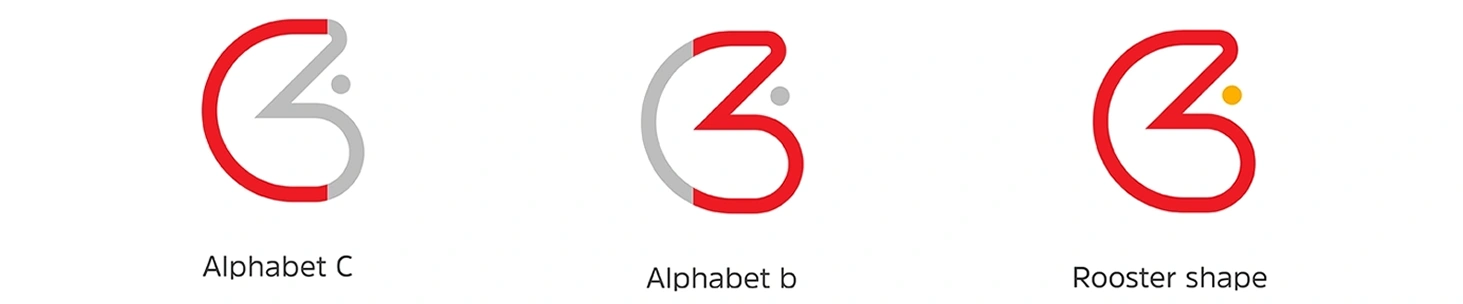
The logo is developed from a creative combination of the letters C and B, which merge to form a clean chicken-inspired symbol. This concept X: 1151.53 px creates a distinctive and meal v: 635.55 px on that connects naturally with the brand. The smooth, rounded typography supports the symbol and keeps the overall look friendly and modern. The red outline highlights the icon as the main visual element, and the small yellow accent adds a subtle point of interest and warmth, making the logo both memorable and visually balanced.